Enodo
Untangle complexity
Enodo Economics analyses and gathers information, distilling the complexity of the global economy and financial markets – producing clear, high conviction and often off-consensus views. The brief was to create a name and visual identity that would communicate this offer.
The word Enodo comes from the Latin to make clear, unfold, untangle, unknot, reveal, explain. This was the perfect metaphor for their process, and once selected as the company name led to an unravelling double ‘e’ logo. The line forming the logo then took on a life of its own as a significant supporting element of the brand toolkit in print, online and in animation.
A distinctive colour palette of bold aqua green, cool and warm grey was developed, with a secondary palette used to supplement the numerous charts and graphs which are a key part of Enodo’s communication tools.
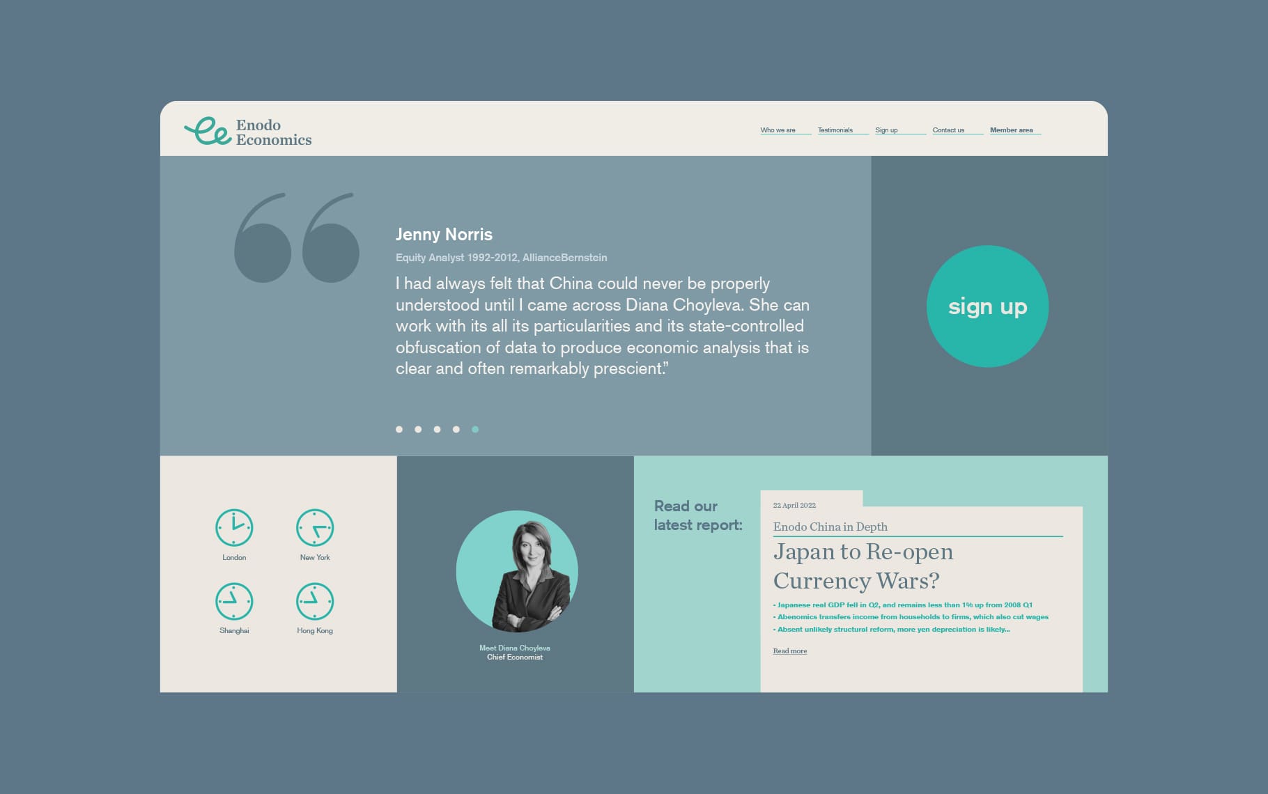
As part of the project scope we also created the Enodo Economics website which was split between an accessible, public facing non-member site and the more in-depth members’ area. The site and administration tools have been built from the ground up as a bespoke suite of tools, services, and member-only content.
Read more